Mobile devices are still the most popular digital items in 2024. Mobile web traffic continues to grow faster than PC traffic, which shows how important mobile-first design is in the field of ui/ux design. With this method, making user experiences that work best on smartphones and tablets comes first, then making changes to make them work on bigger screens. But why is mobile-first design so important, and what are the most important things to keep in mind?
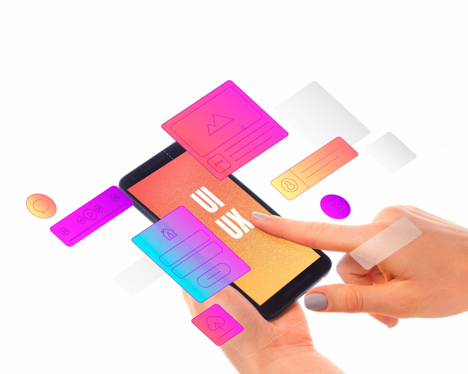
Why Is It Important To Do UI/UX Design?
Let’s go over the importance of ui/ux design before we get into mobile-first design. User Interface (UI) and User Experience (UX) work together to make systems that are not only nice to look at but also easy to use and quick to get around. Good UI/UX design creates good experiences for users, which increases their engagement, conversions, and company loyalty.
What is Mobile First Design?
What is mobile first design? Mobile-first design is an approach that puts the user experience on phones first, then moves on to bigger screens like tablets and desktops. This method is based on the idea that mobile devices have become the main way that most people around the world connect to the internet. When you design for mobile first, you make sure that the most important features and functions work best on smaller screens. This makes the user experience smooth.
Key Mobile-First Design Principles
The following are some basic mobile-first design principles:
- Prioritise Content: Pay attention to the most important information for mobile users. Give information in a way that is clear, brief, and easy to understand.
- Simplify Navigation: Mobile screens don’t have a lot of space. Make navigation options that are easy to understand and use with touch.
- Thumb Reachability Optimisation: The “thumb zone” is the part of a phone screen that is easy to reach with the thumb. Put important features and buttons in this area to make them easy to use.
- Design That Responds: Even though mobile-first is the basis, make sure the design works well on bigger screens so that the user experience is the same on all of them.
- Quick Load Times: Mobile users want pages to load quickly. Image, code, and text should all be optimised so that pages load quickly on all devices.
Mobile First Vs Responsive Web Design
Mobile-First Design and Responsive Web Design are terms that people sometimes get mixed up. In short, here’s what it means:
- Mobile-First Design: With this method, creating for mobile devices comes first, then making changes to fit bigger screens. The main features and the way it feels to be used are made with mobile users in mind.
- Responsive Web Design: Responsive design makes sure that a website’s style and features change to fit different screen sizes so that it looks great on all of them. It doesn’t always put mobile first, but it makes sure that everyone has a good experience on all devices.
Examples of Mobile-First Design
Mobile-First Design has been used successfully by many businesses. Here are some of the mobile first design examples:
- Facebook: With clear navigation, features that are easy to get to, and a focus on content consumption, the Facebook mobile app is a great example of user-friendly design.
- Starbucks: The Starbucks app puts mobile ordering and payment first, with easy-to-use design features that make transactions quick and easy.
Design Principles for Mobile First
It is important to follow mobile first design principles when making a mobile-first experience. Here are some of the primary ideas:
- Simplicity: Focus on the most important features and get rid of the extraneous ones that can make the interface look messy.
- Speed: Cut down on loading times and make sure exchanges work smoothly to keep people interested.
- Touch-Friendly: Take into account thumb reach and finger size when making interfaces that are easy to use with touch motions.
- Responsive Layouts: Make sure that the design can be easily adapted to bigger screens without losing any of its usefulness or style.
- Content Priority: Make sure the information that is most useful for mobile users is easy to find and presented clearly.
Mobile-First Experience
The mobile first experience is all about giving mobile people what they want and need. People are used to getting information and using services while they’re on the go thanks to the popularity of mobile internet. When you create a mobile-first experience well, users can quickly and easily reach their goals, like buying something, reading an article, or getting important information. Businesses can make a good impact on their users that lasts by putting mobile first.
In Conclusion
Finally, using the mobile first design method is important for making great UI/UX designs in 2024 and beyond. Businesses can make experiences that are easy to use, quick, and interesting for today’s digital audience by putting mobile users first and following basic design rules. Adopting mobile-first design is an important step towards making your digital presence more secure for the future. You can do this by using a mobile first design strategy, studying mobile first design examples, or learning the differences between mobile first vs. responsive web design.