In today’s digital era, having a user-friendly website that delivers an exceptional experience across all devices is essential and with the growing number of people accessing websites via mobile, phones, tablets, etc. Businesses are trying to adopt a responsive design approach to ensure the smooth working of their websites. Thus, seeking a professional with certification from a reputed Institution like the Indian Institute of E-Commerce & Digital Marketing (IIEDM).
This blog will explain what is responsive web design, why it’s important, and how to implement it effectively. Let’s explore responsive web design best practices to help you build modern, user-friendly websites.
1. What is Responsive Web Design?
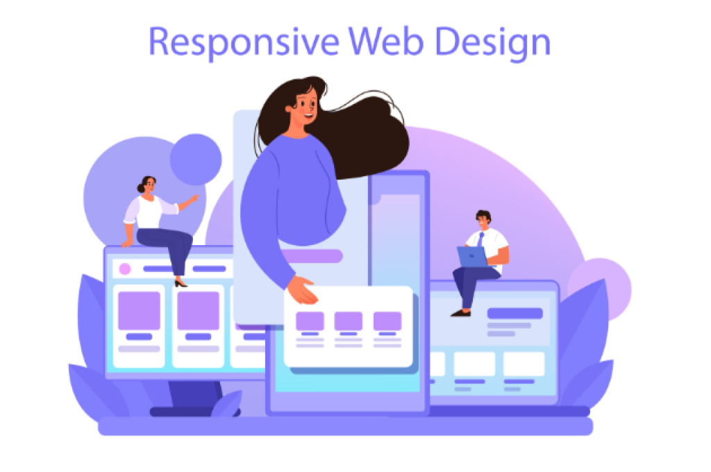
Responsive web design is a web development technique that will allow your website to adapt to different screen sizes and devices. Previously, different versions of websites were made for desktops, tablets and mobile devices. However, responsive web design is a single version of a website that will work smoothly on all devices. It ensures that a single website will adjust its layout and elements automatically according to the user’s device. This adaptability is achieved using flexible grids, images, and CSS media queries.
2. Why is Responsive Web Design Important?
Responsive web design is important because it provides users with a seamless experience across various devices. Following are some key reasons why it’s crucial:
- Mobile-First World: In today’s digital world where everyone has a mobile, 60% of internet traffic comes from them. Therefore, the websites should be mobile-friendly. A non-responsive website can result in a poor user experience, thus leading to higher bounce rates and lost business opportunities.
- SEO Benefits: Search engines like Google prioritise mobile-friendly websites in their results. A responsive design approach improves your site’s Search Engine Optimization (SEO) performance, making it easier to use.
- Cost and Time Efficiency: Instead of managing separate desk and mobile websites, a responsive website consolidates both in a single platform, reducing your maintenance time and cost.
- Improved User Experience: Users expect the websites to function smoothly and process quickly regardless of the devices they are using.
3. Benefits of Responsive Web Design for E-Commerce Websites
For an e-commerce business, having a responsive website is a must and very critical. Here’s why:
- Shopping: Individuals these days tend to shop from any device. Thus, they expect the website to run smoothly.
- Conversion Rates: A platform with responsive websites can easily navigate the users to the purchase page, resulting in an improvement in conversion rates.
- SEO: SEO is one of the important expectations. Thus, when a website runs smoothly, the search engines tend to rank it organically and attract more traffic.
For digital marketing professionals, understanding what responsive design for websites is essential for optimizing campaigns and driving better results for clients. Havingin-depthh learning and guidance from Institutes like IIEDM helps you greatly.
4. Responsive Web Design Best Practices
Creating a responsive website involves more than just making it fit on different screens. Here are some responsive web design best practices to follow:
1. Use a Mobile-First Approach: Start your design from smaller screens first, then slowly upscale it to larger screens.
2. Flexible Grids and Layouts: Design a grid that is flexible enough to adjust based on screen size. This technique ensures that your content remains visually appealing and functions smoothly on all devices.
3. Scalable Images and Media: Make sure that the images and videos are scalable, so they don’t break on smaller screens. Use CSS to control image scaling and maintain aspect ratios.
4. Fast Loading Times: Loading time is crucial as it decides the user experience and SEO. Minimize code, use caching, and optimize images to ensure your responsive website loads quickly.
5. Test on Multiple Devices: Before launching your website publicly, test it on various devices and screen sizes to ensure it performs well everywhere. Use tools like Google’s Mobile-Friendly Test to identify any issues.
5. Responsive Web Design Examples
Many popular websites have successfully implemented responsive web design to enhance user experience. Here are some responsive web design examples to inspire you:
- Amazon: The e-commerce giant’s website is highly responsive, providing a seamless shopping experience across all devices.
- Airbnb: Their website automatically adjusts to different screen sizes, ensuring users can book accommodations with ease, regardless of the device they use.
Conclusion
Responsive web design is a necessity for modern websites. By understanding what is responsive web design and implementing best practices, your businesses can provide a seamless experience for users across all devices. Whether you’re building an e-commerce site or a portfolio page, adopting a responsive design approach will improve your website’s performance, user engagement, and SEO rankings.